Orchard CMS Website Audit
In the previous post we established the objectives of the site along with the target audience. As with any website redevelopment it’s worth looking at the existing site to see what it’s doing right and what needs addressing in the new site. This exercise can prove crucial and ensures that lessons are learnt and improvements are made. I’m not going to cover everything but I’m going to highlight the major issues, but as always I welcome your feedback if you feel I’ve overlooked anything; after all, more heads are better than one!
Design
Design is a delicate topic due to it being heavily influenced by trends and opinion. You can tell that the design was created professionally but over the years it has dated and needs a refresh. The design uses a fixed width layout and on today’s hi-res screens it looks tiny and this width carries across all devices and is not responsive or adaptive in any way.
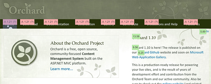
Over the years, the content of the site has increased significantly and no doubt the design was never meant to accommodate such an amount. This is evident with the amount of items in the primary navigation menu and the terminology used to ensure it all fits in the 960px wide layout.
I kind of like how it uses the “nature” side of Orchard and maybe we could modernise and extend this in the next design.
Keep
- Professionalism
- Nature theme
- Content first
Fix
- Responsiveness
- Navigation & content accommodation
- Modernise
Usability
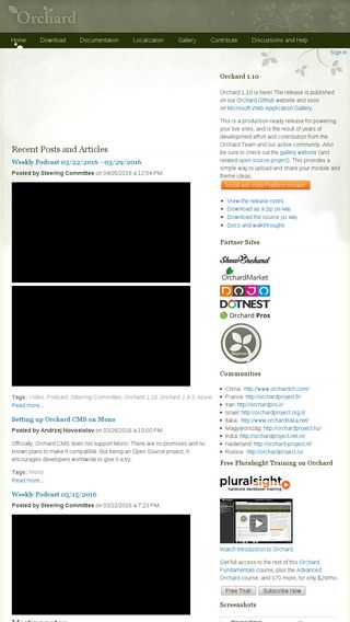
Following on from the design issues and due to the age of the website there are the common issues you find when a site was built pre-iPad. For example, the site isn’t mobile optimised in any way and as a result not touch optimised either. Today, touch is everywhere and not only on smartphones or tablets and must be accommodated for as standard. This means that links are not too close together and text is readable at different resolutions.
There is no clear hierarchy for Call to Actions (CTA’s) and instead there are too many links that are competing for the user’s attention. There is one exception to this, which is the Web Platform Install button which is orange and stands out on the homepage - but this is lacking on other pages throughout the site. Some links fire off to other sites, such as the Gallery, without any indication. On the plus side, hyperlinks are clearly defined and are visible at a glance.
Keep
- Clearly defined hyperlinks
Fix
- Mobile & touch optimisation
- Use SVG’s to make the most of hi-dpi screens
- Clearly identify external links
- Clear primary, secondary and tertiary CTA’s
- Add 404 page
Accessibility
There are a few images that don’t have an

Marketing
It looks like there was little to no consideration when building the site around how the site would be promoted and discovered and can’t help but feel that, as a result, has hurt Orchard in terms of product awareness. The content lacks any “sizzle” and is mainly product facts that fail to highlight Orchard’s strengths in an appealing and engaging way. There is also the conflict around brand positioning and search discovery and whether the term ‘Orchard’ is more preferable than ‘Orchard CMS’ or even ‘Orchard Project’ and when/where to use these. In fact, on a mobile device the main introduction disappears, so many users don’t even get to know what Orchard is without reading more.

My initial recommendation at this stage is to use ‘Orchard’ on its own in the context of Brand and use the term ‘CMS’ in conjunction with the technology e.g. “A great CMS built with ASP.NET MVC”.
A primary call to action should be on most, if not all pages and should lead the user on a journey to the desired goal. In most occasions this would be to download or try Orchard but could be different based on the desired objective. Either way, these user journeys need to be defined and catered for, ensuring the user is guided through to conversion.
Search Engine Optimisation (SEO) is a big part of the website being discovered, and again, over the years this area has evolved and several best practices have emerged that are not being utilised. I used a few tools to help analyse SEO best practices:
- Google Analytics
- Moz
- Majestic
- SpyFu
- SemRush
- SimilarWeb
- SEO Spider
Here is a few things that could be improved:
- Making the most of page titles
- Adding meta descriptions
- Adding SSL (for whole site)
- Keyword optimisation
- adding an XML sitemap
- Canonicalise www - single preferred domain
- Add robots.txt
- Optimised friendly URL’s
- Optimise headings and remove duplicates
- 301 redirects
Currently, the traffic and backlinks to the site are split across www and non-www domains, which in the eyes of Google could be seen as duplicate content and therefore trying to spam Google; this could have a direct negative impact on rankings. In addition, backlinks are watered down due to sites linking to separate subdomains. By having one preferred domain those backlinks are combined. Lots of websites, especially websites that are high traffic or seen as authorities that link back to the Orchard website is good for search rankings; especially when the hyperlink text has our desired keywords in.
It would be good to have the documentation and the forum on the same domain but I don’t think this initially feasible. Another nice addition would be for all the asp.net blogs that link back to Orchard to be optimised for the primary keywords. I’ll concentrate on the “on-site SEO” for now.
Keep
- Main introduction (but maybe include ‘CMS’ in addition to ‘Content Management System’)
Fix
- Product positioning
- Consistent tone of voice
- Defined CTA’s
- All main SEO issues
Performance
The performance of the existing site isn’t too bad but can be improved. My tools of choice are:
- Developer tools (F12)
- Webpage Test
- Google’s PageSpeed Insights.

The TTFB (Time to First Byte) is 0.354 seconds which is good (we want to be below 0.5s) and this is down to the caching within Orchard. But as you can see the actual load time along with the number of requests are higher than we would like. The number of requests can be reduced or nullified by moving to HTTP/2 compatible server. We have to be careful taking these figures on their face value though because with further investigation we can see that most of this time is taken up with async third party scripts and embeds, such as YouTube and Analytics. First render is 1.5s and the DOM loads at 1.6s. All these figures are taken from a fresh visit with no local cache and subsequent visits are a lot quicker.
Keep
- Server caching
- Small page size
- Gzip
- Minification
Fix
- Reduce requests (or move to HTTP/2)
- Optimise images & responsive images (deliver the right size image for the user’s resolution)
- Use CDN
- Consider using critical CSS
Information Architecture
Let’s first look at the primary navigation; there is currently eight items which is slightly more than I prefer as it’s more for the user to scan (cognitive load) and more difficult to design for and due to its single dimension it doesn’t scale well when wanting to add more content. I think the terminology of some of the items could be improved. For example, the word ‘Gallery’ could mean photo gallery and therefore I would prefer maybe ‘themes & modules’. Localisation could be grouped with Contribute and maybe renamed to ‘Get Involved’.
There is no obvious place for Orchard Harvest to live so maybe an ‘Events’ section may be required. This could also provide a place for meetups and webinars to live.
I think there is no clear route to getting started. This is one of the primary user journeys and needs to be a priority and currently this is lacking. Unless you land on the homepage or the download page then there is no easy way to download or try Orchard. This must be omnipresent across the site. For a first time user, which is the best download option? Should it be the full source or the WPI? This needs to be clearly explained along with setup instructions.
Social
As a frequent attendee of Orchard Harvest (the official annual event) I can verify that the Orchard Community is awesome with many of them connected on social networks such as Twitter, Facebook and LinkedIn. I think there is room for improvement in this area but can be addressed post-launch.
Summary
I’ve tried not to be too critical; after all the site is over seven years old and has served us well and there is a lot that the site is doing that is good. We need to ensure that the good parts are not lost during the redevelopment. In the next post, we’ll look at what other CMS vendors are doing on their sites and see if there are anything we can learn.
