
Comparing CMS Vendor Websites
Introduction
This is the third in a series of posts (see previous posts) where I’m blogging my approach in the redevelopment the Orchard CMS website. In this post we’ll look at what the other CMS vendors are doing with their websites and analyse the good, the bad and the ugly.
umbraco.com
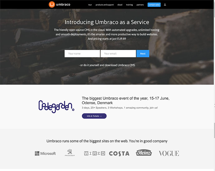
Likes
- Instantly offers the user to try the product with little friction (albeit for the price of an email address)
- Lists house hold names as clients (provides reassurance)
- Title tag has desired keywords (The open source ASP.NET CMS)
Dislikes
- Header CTA is to ‘Call Sales’ which makes you believe that the product is not FREE
- Too many conflicting CTA’s on the page; should I ‘Contact Sales’, Signup, visit ‘Our Umbraco’ or ‘Buy Support’
- Design is too “template” looking
- You automatically get signed up for email marketing even though I never opted-in to it when trying out the Umbraco as a service
drupal.com
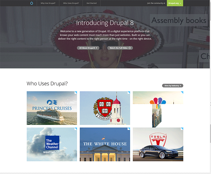
Likes
- The website is focused on “new” users existing users are directed to the community site which is on the drupal.org domain
- The ‘Who uses Drupal’ has some good customers, some with case studies
Dislikes
- 110mb video that is difficult to see
- The ‘Getting Started’ section isn’t getting me started but leading me off to the .org site
- Weak testimonials and ‘Why use Drupal’ section
- Many of the menu items with the mega navigation are disabled
wordpress.org
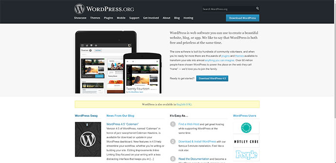
Likes
- Download CTA is clearly shown and accessible across the site within the header
- Concise intro
- Themes & plugins easily searchable and accessible within the site
- Support & documentation all in one area and contained within the site - great for SEO
- Get Involved section highlights all the different ways people can get involved with the growth of WordPress
- Blog that is used for official news
Dislikes
- Intro graphic means very little to me
- Bottom half of the homepage is week and offer nothing
- Conservative design
ghost.org
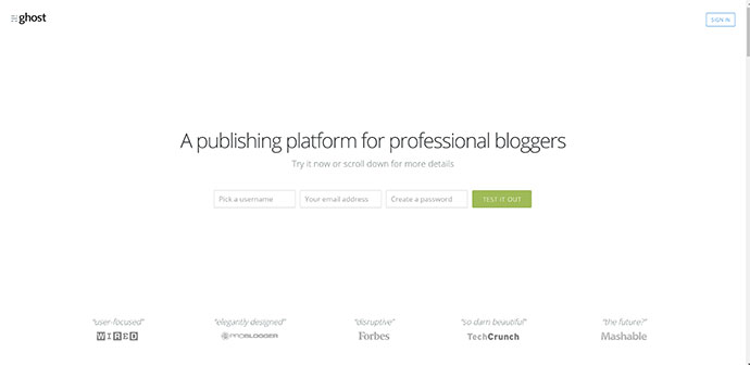
Likes
- Clean design and not too much content on the homepage
- Clear and immediate CTA to try the product with a low barrier (no email address)
- Powerful testimonials
- Product is shown in desktop and mobile views showing the product has been designed to be mobile first
- Homepage is focused on selling the product and not trying to be a summary of the site - i.e. latest news, blog posts, ads
- comprehensive and searchable documentation
Dislikes
- No primary navigation on the homepage
- Lack of community material
Conclusion
I’ve only highlighted a few sites I visited, but overall, there are no real big surprises here but there are some interesting points that demand more investigation and discussion. Traditionally, the role of the homepage on many websites is to act as a synopsis for the site, highlighting the different areas and pulling through bits of their content. But, over the last few years or so we have seen sites that use the homepage to sell the product to the user. Examples of this are: InVision, Xamarin, Basecamp, Spotify, AnyList and of course Ghost. Interestingly, Ghost take this approach and positions the CMS as a product - which it essentially is.
I’m keen to explore this area for the Orchard site and to see if it fits with the requirements and the user journeys.