
Information Architecture for the New Orchard Website
Information Architecture (IA) is all about organising, structuring and the labelling of content. The role of IA is to help the user find information and complete their goals. I’ve found that IA is by far the most debated areas during the planning phase and therefore I strongly suggest collaboratively working with at least two other people to ensure everything has been covered off.
Card Sorting
For larger sites, or for sites that are in industries that you may not be familiar with, it may be worth running a workshop with the client to logically group the content. During this workshop, it’s advised to concentrate purely on categorising the content and not worry about the navigation which can be added later. But as we’re working with a relatively small and familiar site we’ll skip this stage and roll it into the sitemap process and do both tasks at the same time.
Sitemap
A sitemap shows the structure of the site and how each page will be linked together. The sitemap’s job isn’t to show every page the site contains; this could be unwieldy (imagine trying to map out a site like amazon.com!), but should cover the primary, secondary and tertiary levels.
The sitemap needs to show the pages that support the user goals along with the structure of these key pages and labels for the navigation. The labels should reflect the users’ needs and use language that our users find familiar.
Like with other areas of the planning phase, I use old skool pencil & paper the most part, with Paper from fiftythree & Microsoft Visio when required. I find myself changing the structure and terminology at least 3 or 4 times before I run it past someone to gain feedback. Once everyone feeds back, it can then be finalised and form part of the specification document.
First Attempt
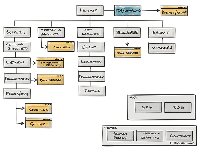
Analysis
The primary navigation has been reduced to five items. There is a theory that 7+/-2 is the ideal number of items on a primary navigation. There are people that think this is a UX myth but I’ve always worked to this as a general guideline as I think it’s common sense that too many items will be difficult to scan and design for.
The site’s primary CTA has been placed into the header which allows it to appear in the same place on every page. This means that no matter which page the user arrives to the site on, they can quickly try Orchard. This also mitigates the need to aimlessly putting in-page CTA’s that could detract from the content and the current journey that user is on. For example, we don’t want to target users with a ‘Try Orchard’ CTA when the are looking into an advanced topic in the docs as they are highly likely already a user of Orchard.
The first section of the site is labelled Support: I’m not entirely sure this is labelled correctly as the word “support” could mean commercial support. This section encompasses all information around working with Orchard. An alternative would be elevate the “Getting Started” section and have this as the label and when clicked through it would take the user to the page of getting started. This has the benefit of prioritising the information that most of the audience would be initially interested in, but it has the down side that it hides the other items in that section as the label isn’t encompassing of the other pages. A better alternative would be to call the section “Resources” which I think would solve the issues. I’m going to think on this a little and open it up to feedback.
Getting Started is a key piece of information that will directly aid adoption (a key objective). This page is likely to be signposted to from many other pages.
Learn is again probably not the correct labelling. I think it’s too generic and therefore will not appeal. This page is to act like the feed on the homepage of the current site but with advanced search and filtering. Maybe something akin to the built with angular website. This would just bring back the summaries and then link off to the author’s website. This page could also contain links out to other resources such as books and courses or if there is enough of these they may warrant a page of their own.
Documentation is a page that just explains how the documentation works and links out to the documentation website. Signposting to the “Get Involved » Documentation” section for users that wish to contribute would also be helpful.
Forum/Chat is a page similar to the documentation page. It explains how they work and links out to the codeplex forum and gitter chat.
Themes & Modules the labelling here has been changed from Gallery as I felt this could be misleading and mean a photo gallery. I think being explicit works well here. I did think about renaming modules with plugins as users may be more familiar with that terminology but a part of me wanted to keep the Orchard identity. Maybe this could be A/B tested and tweaked accordingly (validated learning). The page itself is a simple page explaining what themes and modules are and linking off to the gallery site.
Get Involved is a section that covers all areas where members of the community can help out. This page would talk about the weekly meetings and the community as a whole and links to sub pages for each area that people can contribute. I considered calling this section “contribute” but I felt that Get Involved seemed a little more encouraging. Again, this may be an area to split test.
Code, Localisation, Documentation and Themes are all content pages explaining how to get involved in each of the respected areas. Depending on the amount of content, these could be sections of a single page but for now they are a separate pages as I think there could be quite a bit looking at what we currently have on the existing site.
Showcase maybe too generic again in terms of it’s labelling. Maybe “Who’s using Orchard?” or “Customers”. I think “customers” make Orchard sound like a paid for product. Depending on tone of voice it could also be “Orchard in the Wild” or similar - feedback would be very much welcome here. The way is see this page working is that we would list some of the key companies that use Orchard along with relevant case studies (if that content is available) and then link off to the ShowOrchard website to show the rest.
The About section gives us a place to talk about the Orchard story, the steering committee and core members. This content provides additional reassurance that the project has a long history and supported by an established team a large community.
2nd Attempt
After a bit more thought I decided to bring Getting Started up to the top as I think this is a key area for our audience who are looking to adopt Orchard. I’ve also renamed Support to Resources which I’m still not 100% on but feel it covers the contents better and is not misleading. I’ve also demoted the About to the footer due to it not being as strong as the other areas for our target audience.
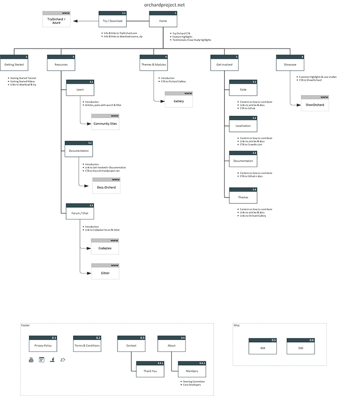
View the PDF version of Sitemap v2
Wireframes
Wireframing is a common practice when planning websites and can be really useful in many situations. The problem with wireframes is that they mean different things to different people. Some think they are essentially lo-fi designs whilst others think they shouldn’t infer design but instead dictate the content and features of the page and their priority. Either way, I believe that you can do this work with prioritised lists and directly in Photoshop or the browser. On the sitemap above, you’ll notice I have listed content hints bellow each page which will aid me in the design phase.
Summary & Next Steps
There is a lot more we could do but I’m confident I have enough now to progress to the design stage….Yippee!!!
- Objectives & Audience
- Orchard CMS Website Audit
- Comparing CMS Vendor Websites
- Humanising our Audience with Personas
- Project Requirements for the New Orchard Website
- User Journeys for the New Orchard Website
- Information Architecture for the New Orchard Website (this post)